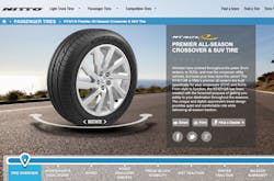
Nitto Tire U.S.A. Inc. has launched a new website with a scalable design, personalized user experience and improved search engine optimization.
The company says the website’s responsive design instantly recognizes browser dimensions. Nitto has seen its web traffic lean heavily towards the mobile and tablet user over the past few years. The company’s new website optimizes the layout for all desktop screen sizes as well as mobile devices and tablets in both portrait and landscape orientations.
"Our goal was to create the most advanced and forward-thinking website in the tire industry," says Stephen Leu, assistant manager, brand publishing.
"We wanted our customers to not only be able to explore our site with ease across every platform, but also benefit from a customized user experience that helps them make an educated and informed buying decision."
To create a custom user experience, Nitto adapted common elements from the top-performing e-commerce website. For example, user-generated product reviews from a third-party review provider are integrated into every product page. This allows the consumer to instantly browse real-world feedback from actual users in order to help them determine which tire best meets their needs, according to Nitto.
In addition, new large-format 180-degree and 360-degree product rotations in a responsive 3D image rotator allow the consumer to see sidewall and tread designs in better detail.
To see the new website, visit www.nittotire.com.


